Duration
4 weeks
What I did
UX research, UI design,
Prototyping, Usability testing
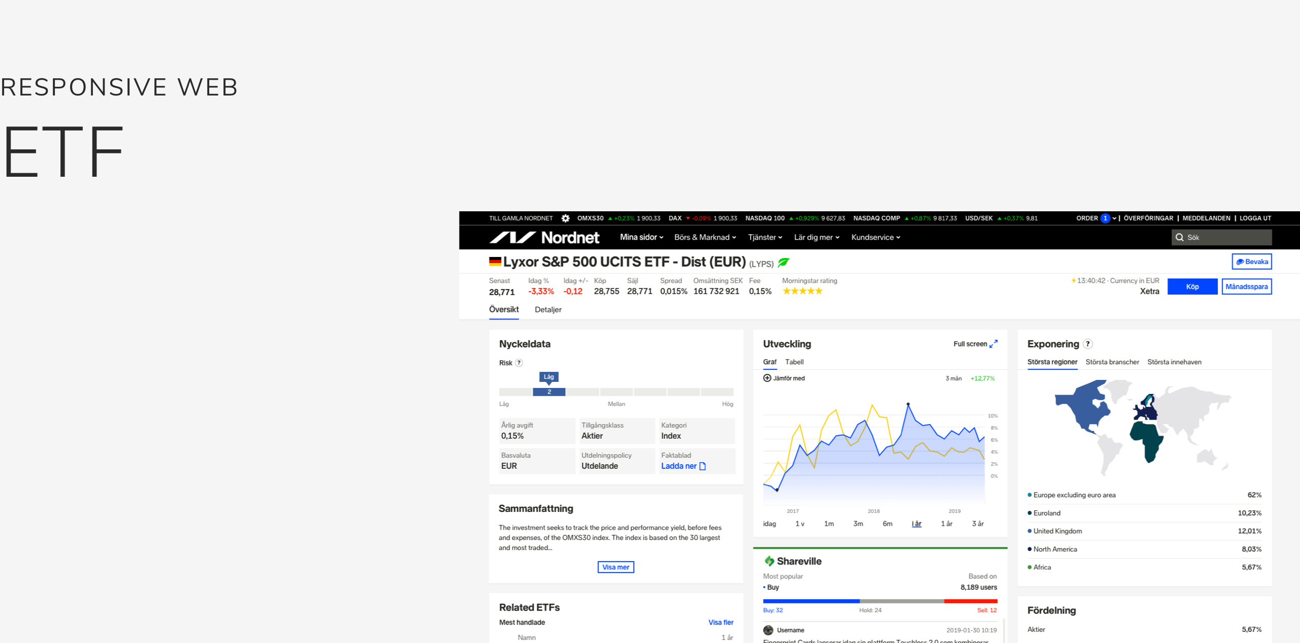
I was responsible for revamping the stock instrument page. The goal of this project was to align the new ETF page with the stock page while making sure the information was well presented.
ETFs (Exchange traded funds) are one of the most traded instruments on Nordnet right after stocks and mutual funds. The number of trades occurring on ETF are slowly passing the number of trade in mutual funds, especially in Finland and Denmark. Since ETFs are exchange traded, users can buy and sell them immediately rather than waiting for the mutual fund purchase for a few days.
Problems
Insufficient data points
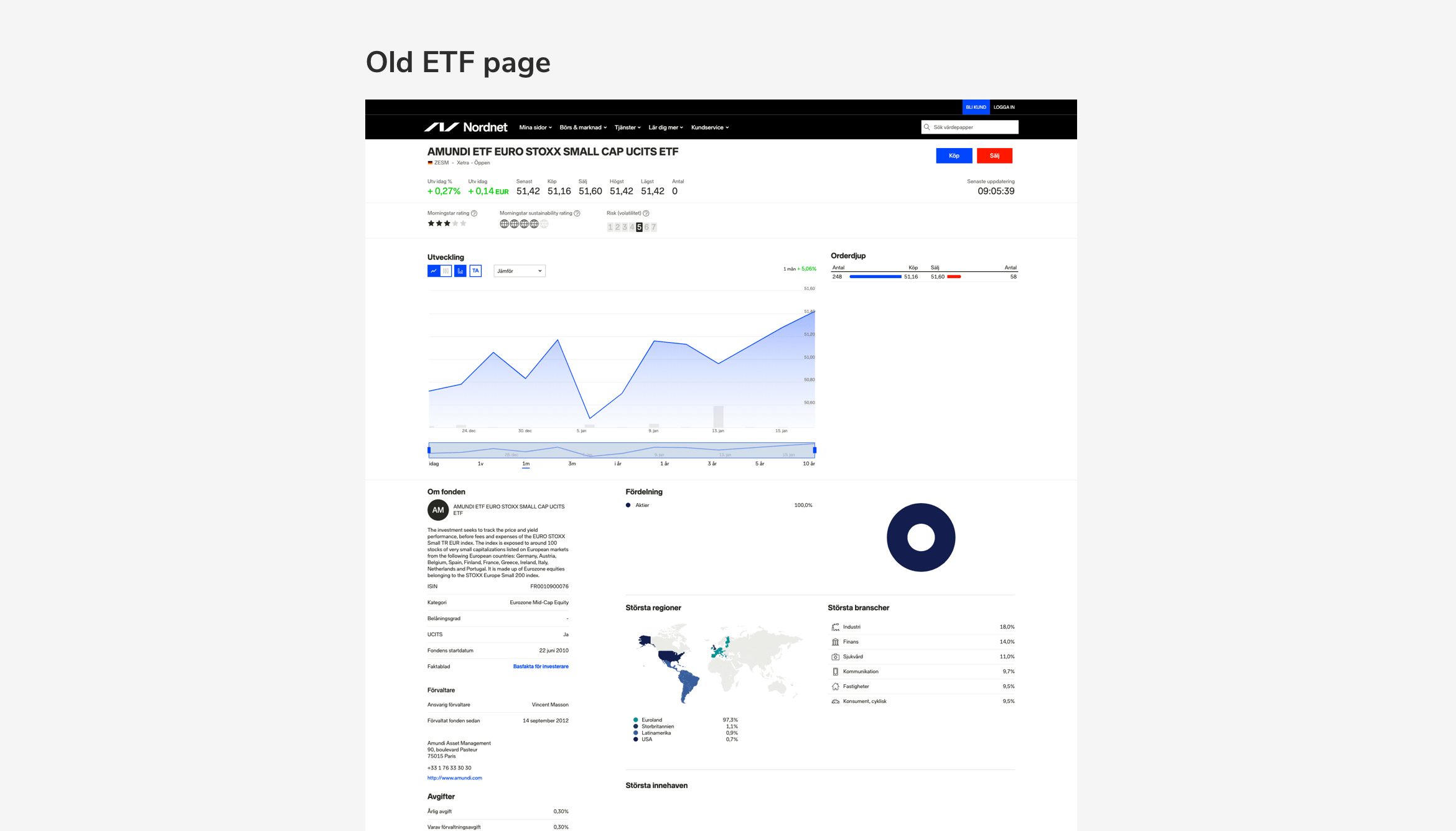
The current ETF page on the website is using the same template as the mutual fund instrument pages. A lot of data points needed for trading ETFs are missing.
Too much white space
Investors like to see all the information they want at a glance, they do not like to scroll. They want to be able to quickly make decisions on whether to buy an instrument at a specific price. However, in the current page layout, there is a lot of empty space at the top of the screen, which makes users need to scroll down the page to look for the information they need.
Research
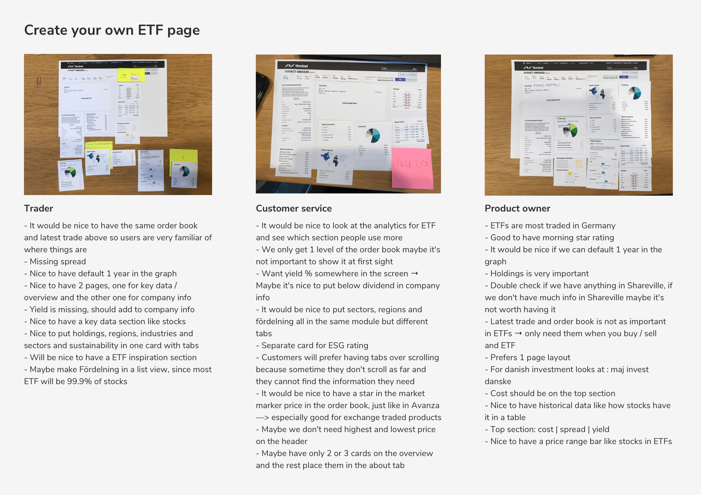
I ran a workshop with traders and customer service to fully understand the needs and requirements of our customers. The workshop was separated into 2 main sections. First, participants were asked to build their ideal ETF page and explain the thoughts behind their designs. Second, I printed out ETF pages from other websites to analyze and understand what our participants liked and disliked about them.
These were the main takeaways I took from the workshop:
-
-
- Missing spread in the header
- The exposure is very important that’s one of the first thing they look for in an ETF
- Doesn’t want the order book and the latest trade in the first page
- Want a second tab to put less important information
- The pie chart is meaningless in allocations
-
Flowchart
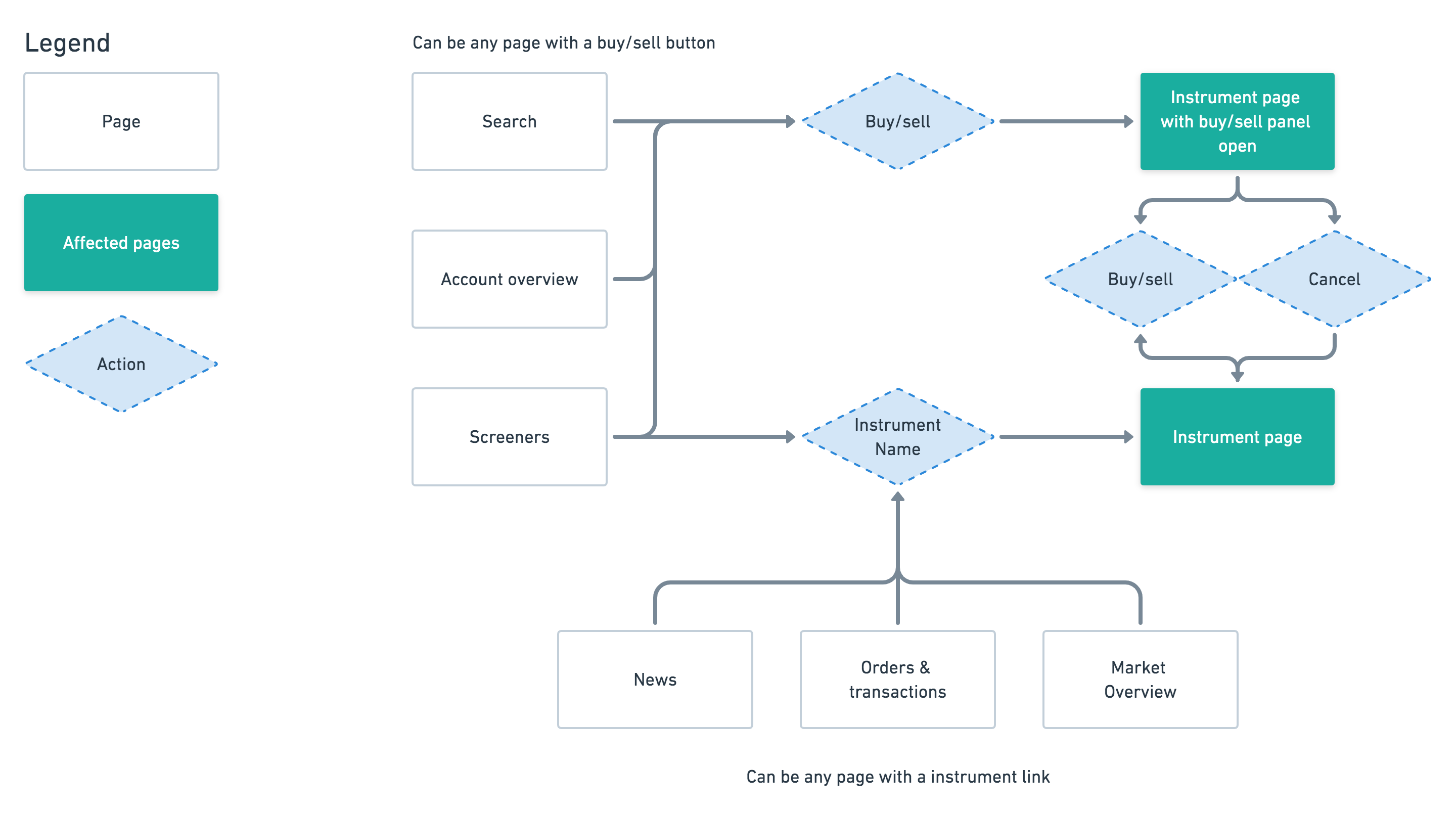
To make sure we considered all of the different states of the instrument page cover, I created a flowchart to understand the ways users could access the instrument page and what state they expected the instrument page to be in when they clicked on different elements on the site.
Analytics
I talked with the analytics team to understand how customers are interacting with the existing ETF page.
Here are the data I got:
- 40% of our users do not scroll our page at all
- 84,2% of all ETF trading is buy and hold
- 76% of users use the range selector under the graph and most users click on 1 year
- 54% users land in the ETF page from search or directly
- 60% of users click on the Shareville comment box
- 84,2% of our ETF trades are NOT traded on the same day
- 97,8% of our ETF trades value are non monthly saving ETF trades
Ideation,
iterate &
user testing
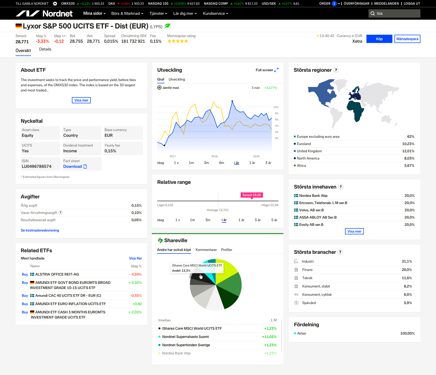
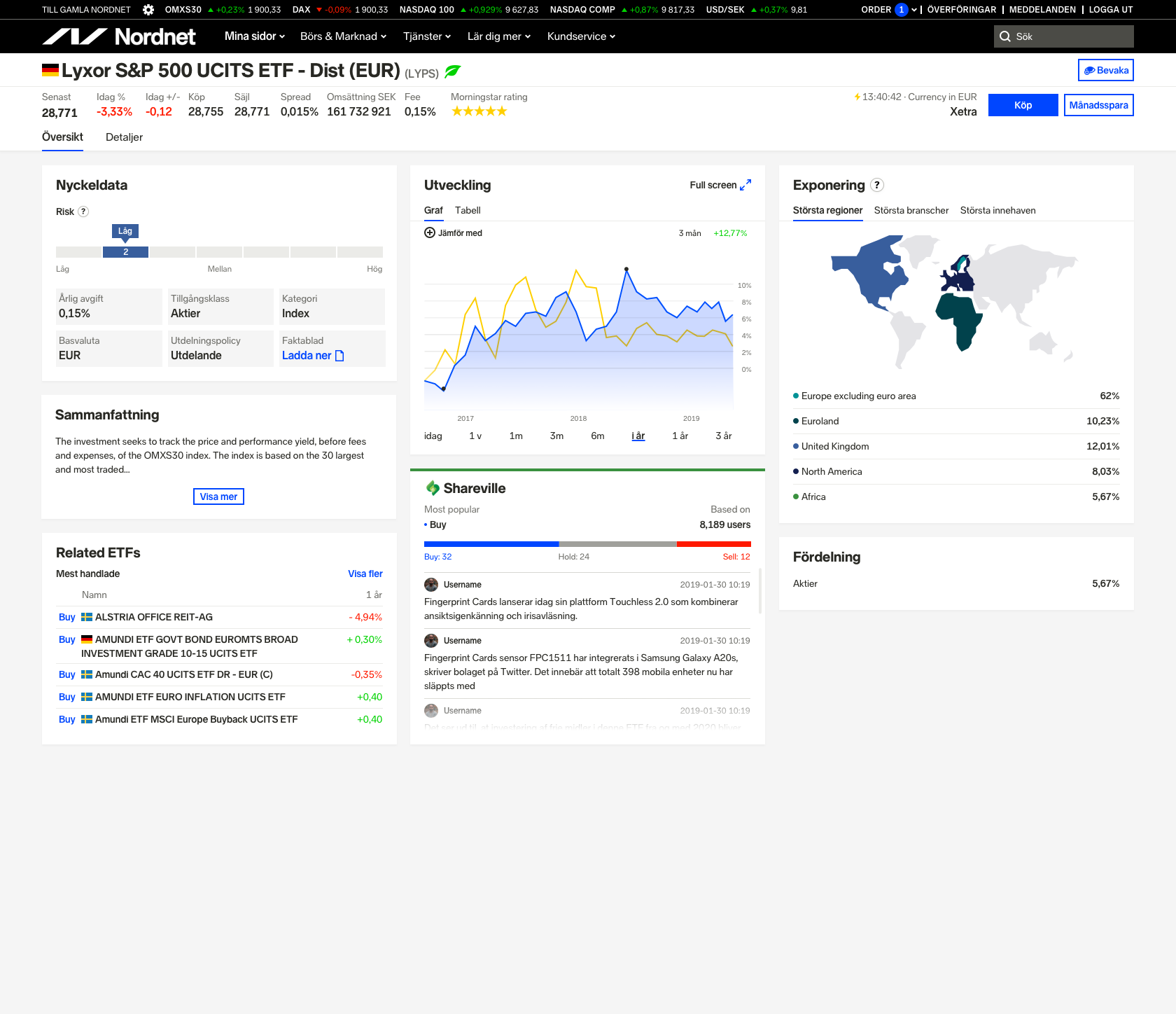
To keep the consistency between the stock instrument page and the ETF page, I am going to reuse most of the components between the two pages. I skipped creating wireframes by using UI components directly from the stock pages to quickly explore how the page would look like. I have created a couple drafts of the ETF page based on the data from analytics and the main takeaways from the workshop. I then synced with my product owners to choose the two of my drafts for user testing. Based on the results, we modified the design and repeated the user testing. In the end, I created over 10 iterations of the page to come up with the final solution that all stakeholders were happy with.
Scroll version
Tab version
Outcome
After the release of the ETF page, trading in ETFs continued increasing. Users are happy with the solution we came up with, they can clearly see what they have invested in. At the same time, with the increased usage of the page, we are receiving new feature requests that we will look into adding in the future.
The main takeaway of this project for me was:
Trust the data
Towards the end of the project, we landed with 2 versions of the page. One that allowed users to see more information by scrolling through it while the other one was separated by tabs. We did a lot of internal testing which showed that users were split 50:50 between both options. In the end, the data of scroll depth was key to our decision, we learned that 40% of our customers don’t scroll on our current page.
