Client
Client
BBPOS
BBPOS
What I did
What I did
UI/UX Design
Project Management
UI/UX Design
Project Management
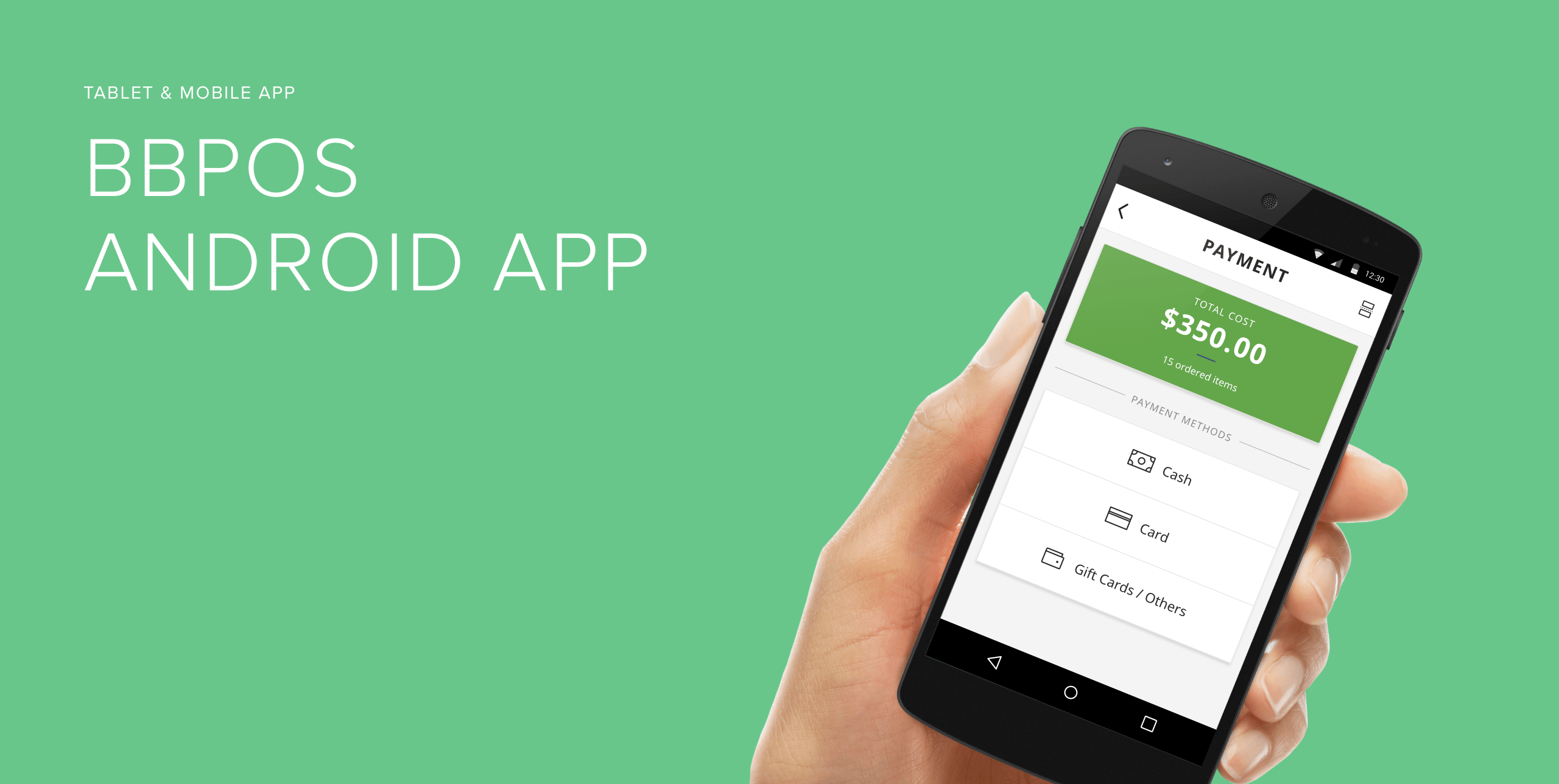
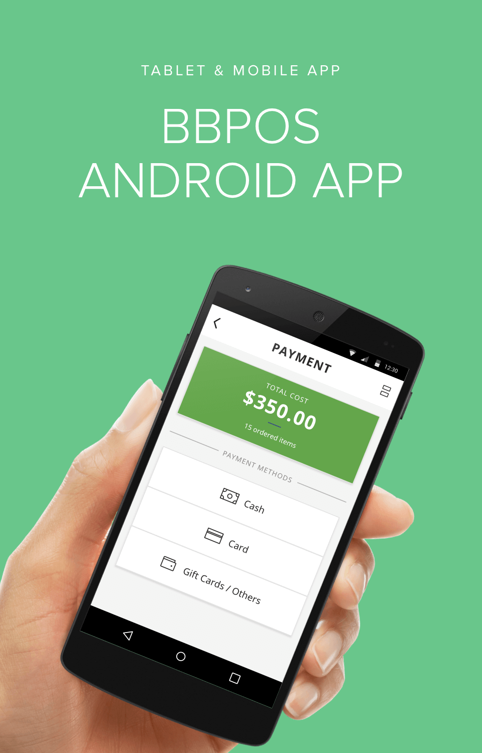
BBPOS is a leading innovator, designer, manufacturer and provider of end-to-end mobile point of sales solutions for all sectors including Mobile Merchant, Retail, Hospitality, Delivery, Transport and Government.
I’ve helped them design an Android mobile and tablet application that brings all the functionality of a traditional point of sales system to a mobile-based solution.
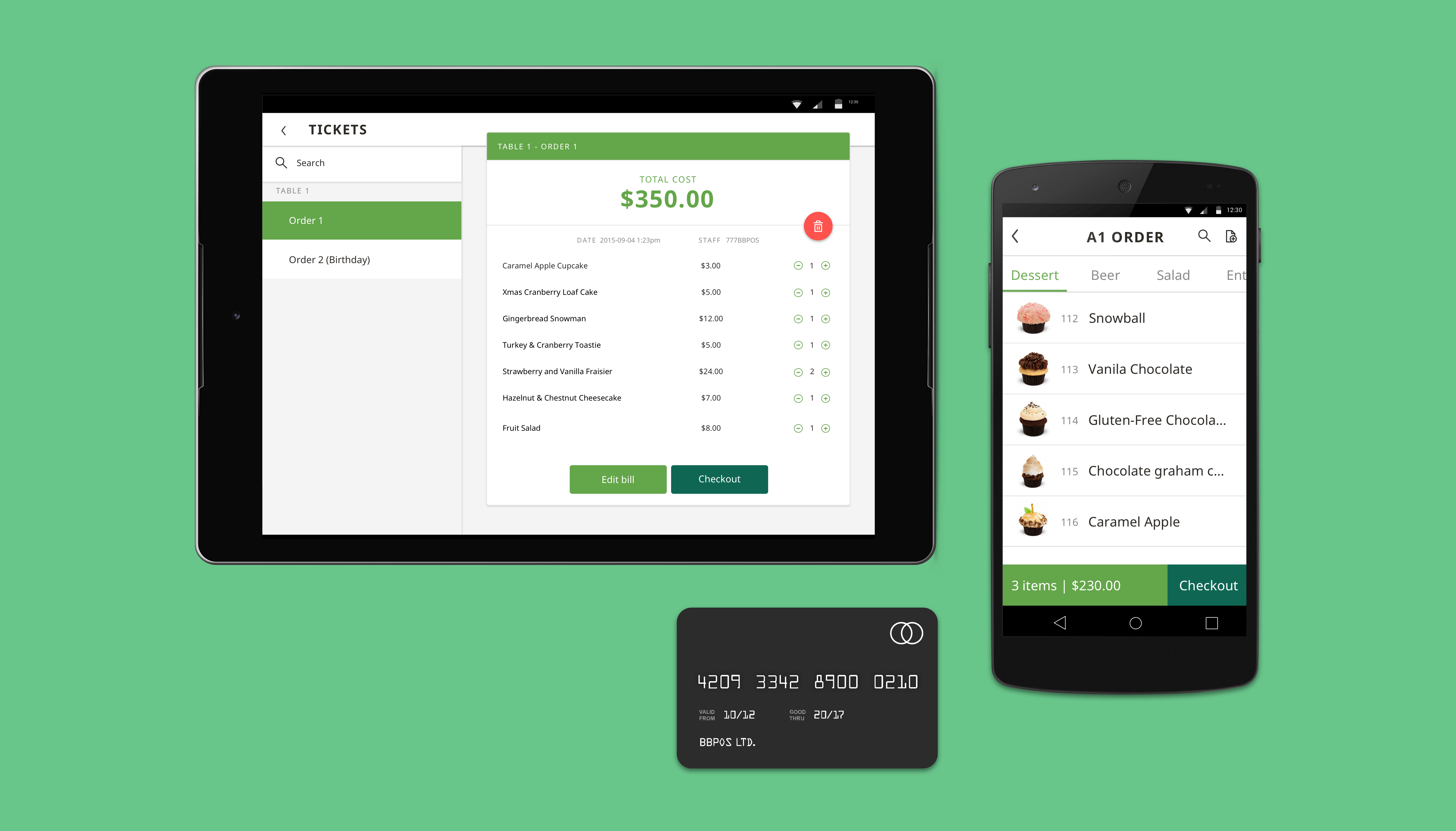

Design Process

Understand
the Problem
The company had the problem that there were not enough restaurants willing to use their Android mobile and tablet point of sales application because there were not enough features that fit their needs.
To understand the problem, we firstspoke with the company staff to understand the user feedback of which features restaurants thought were lacking from the current application. We then deconstructed both tablet and mobile application by creating a screenflow of each to learn about the current flow of information and also to check whether there are problems with the information architecture.
Main insight
The information architecture of the app made sense but the size of the buttons and text were very small, it was very hard for users to use on-the-go.
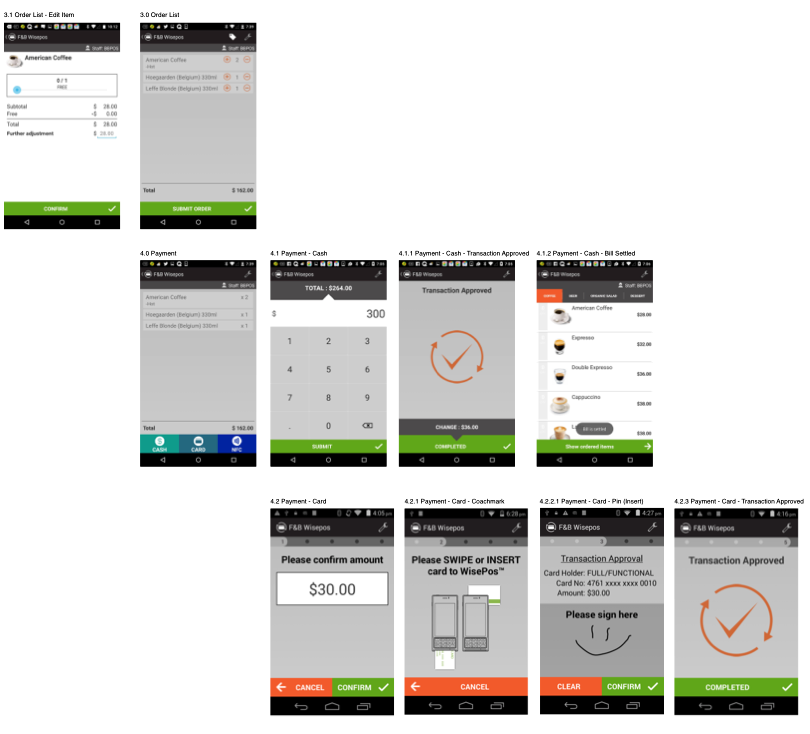
Wireframe
Due to time constraint, we created wireframes alongside the old application screens. We realized the flow of some screens was still valid, while new features could be added next to them.
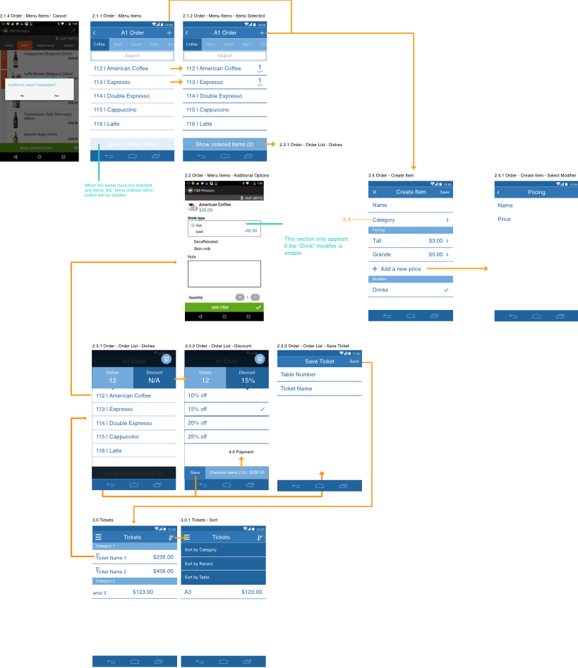
UI Visual Design
After designing the flow and information architecture, I’ve moved on to add some colors and details into the design. I have decided to use light green which is BBPOS brand color based and complement it with a dark shade of green.
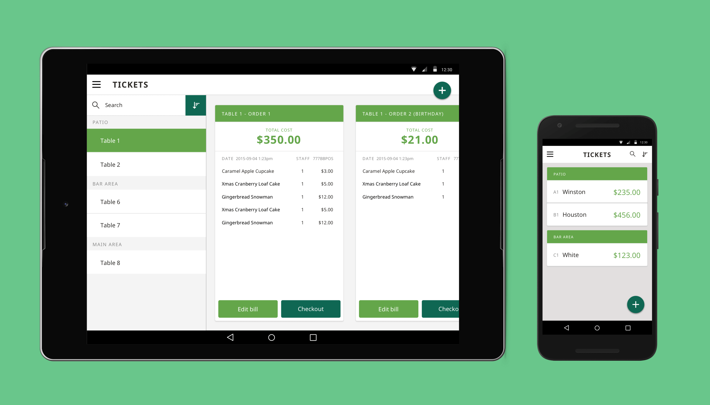
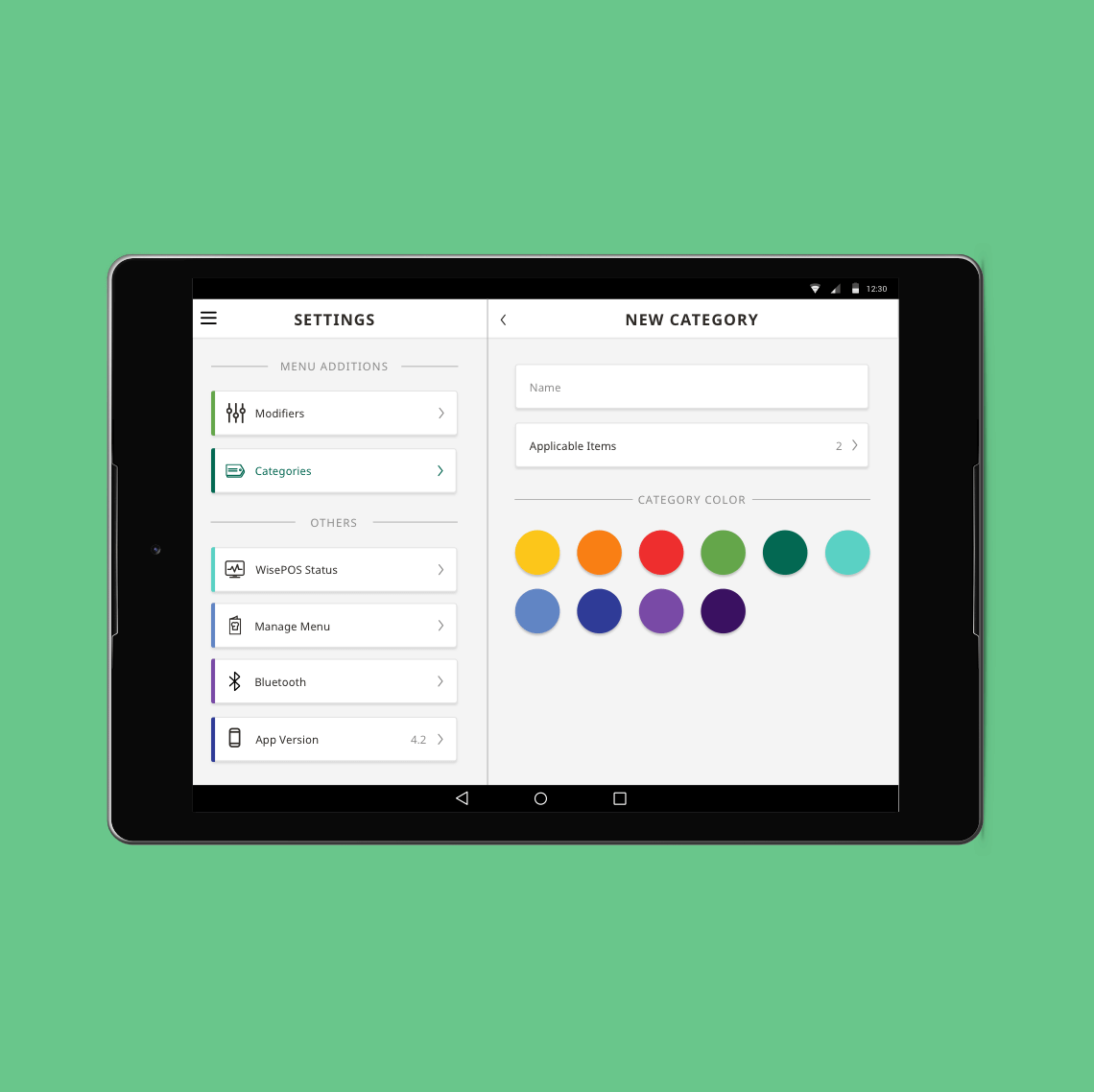
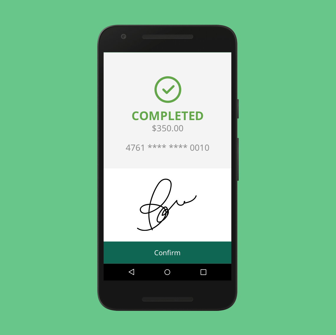
Color Scheme

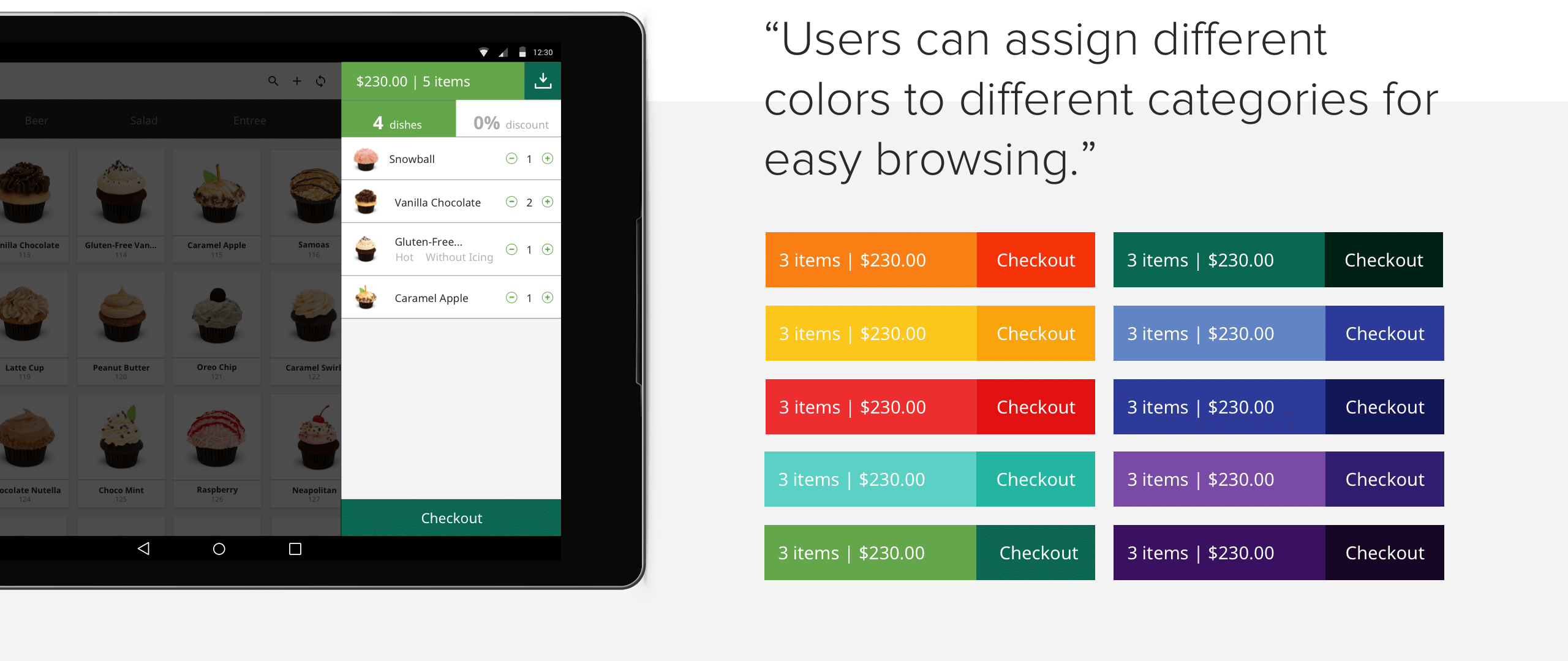
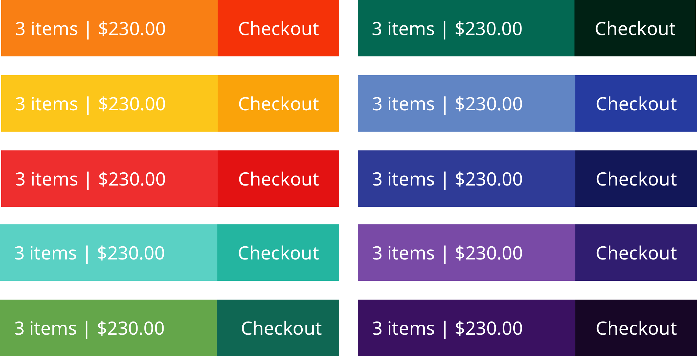
“Users can assign different colors to different categories for easy browsing.”
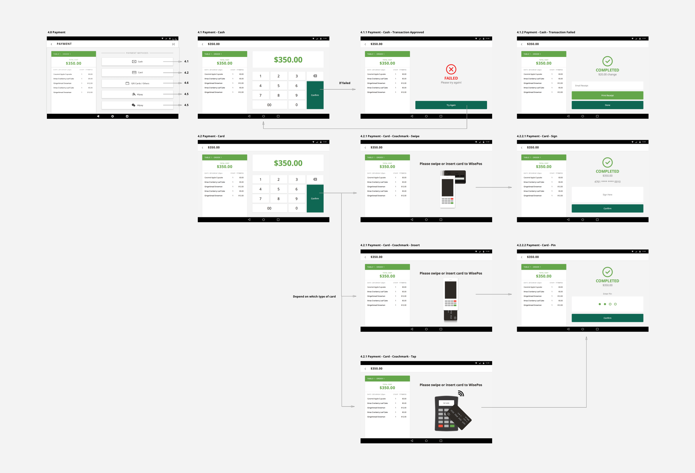
Final Screenflow
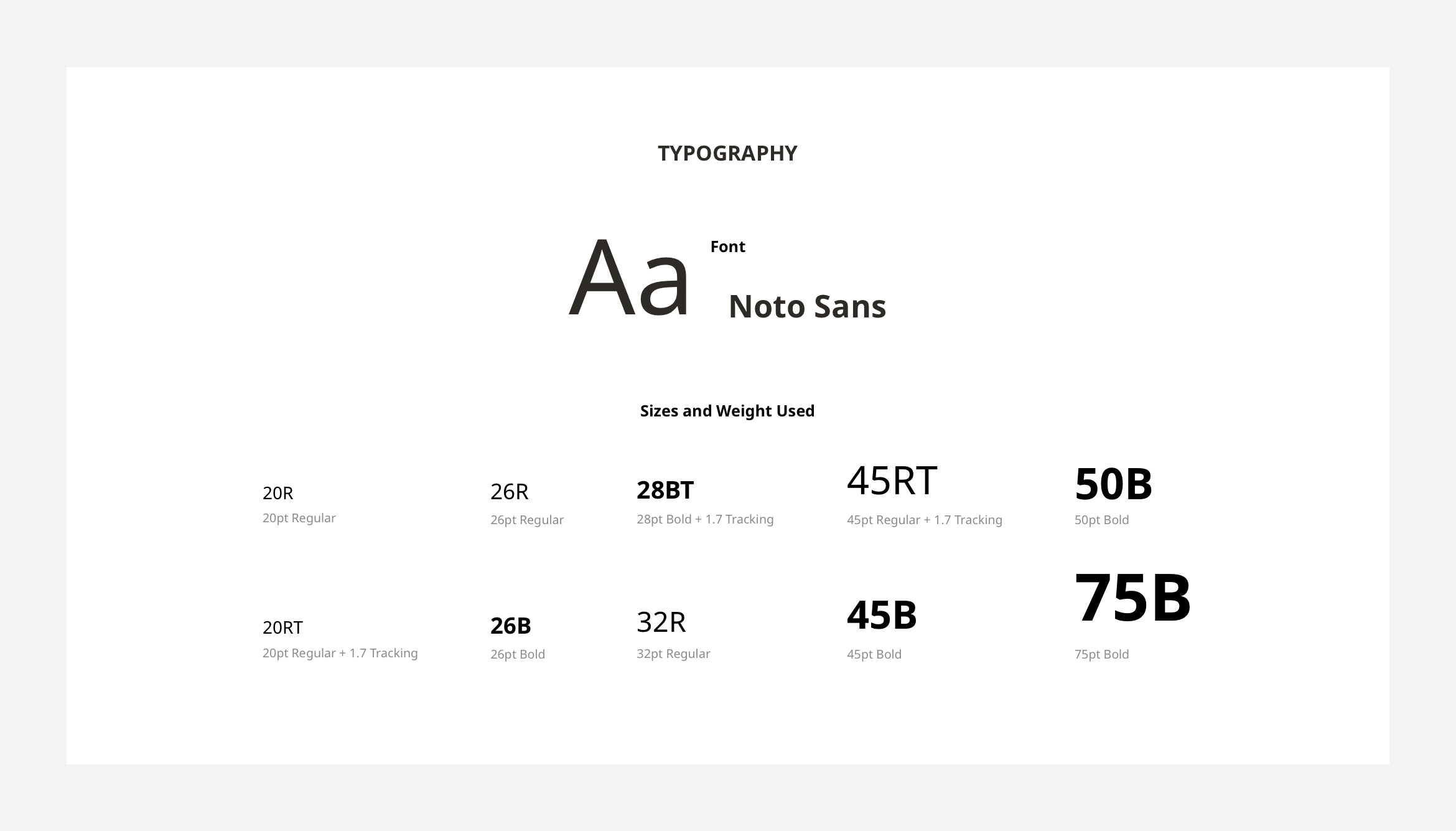
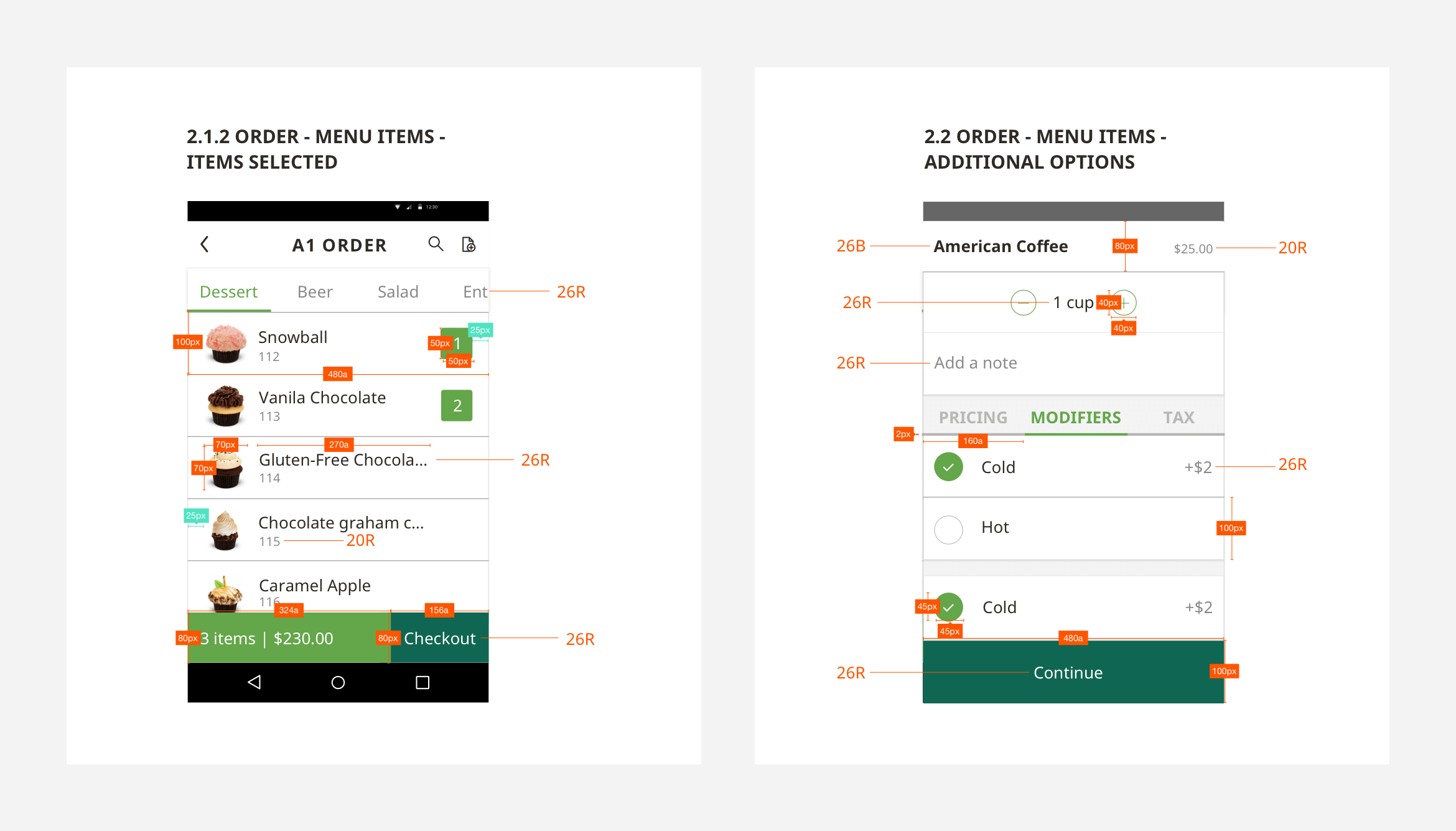
Design Guideline
Design Guideline is a documentation I use to communicate with our client’s developers on the exact dimensions and interactions of the applications.
